Camino
Identity
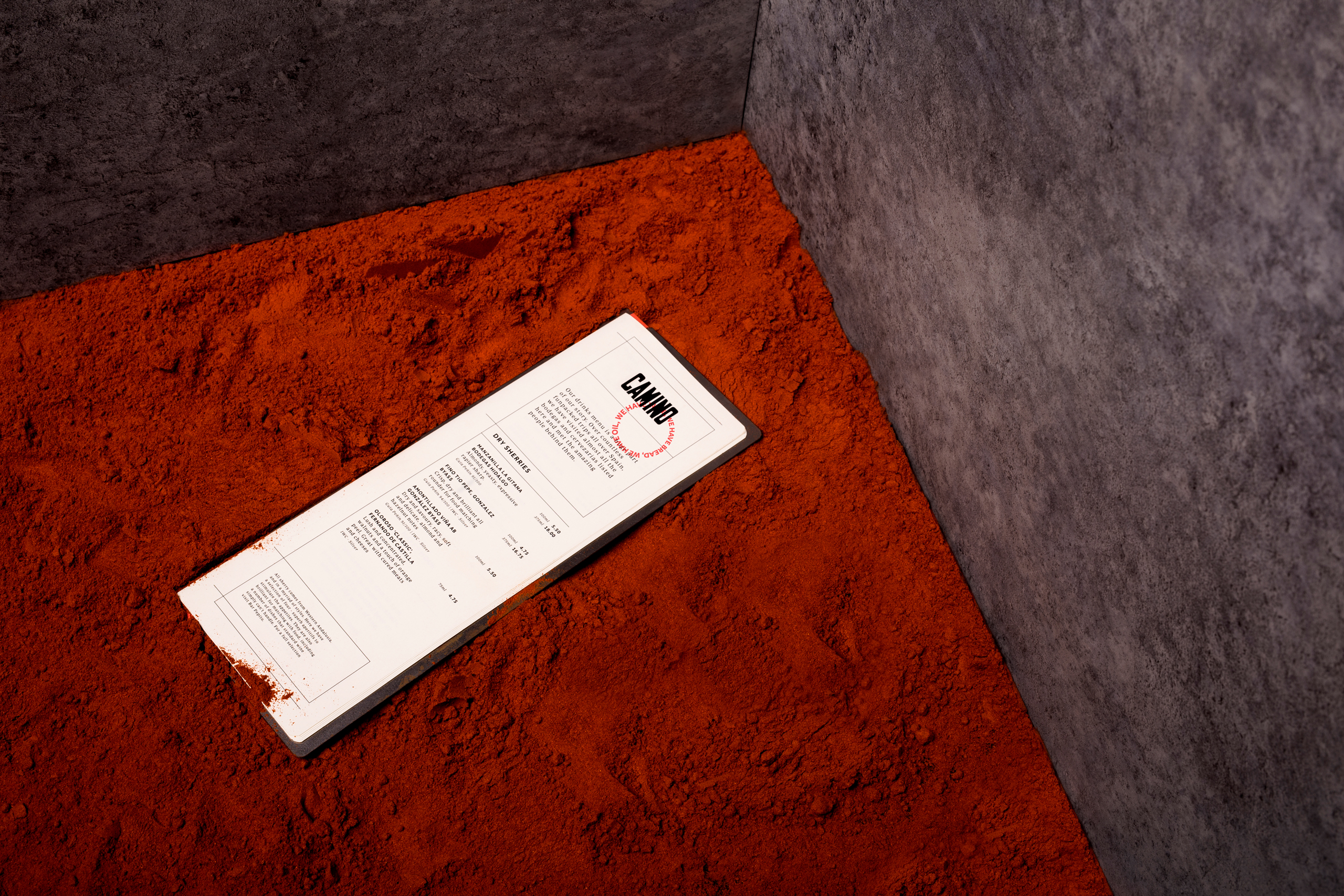
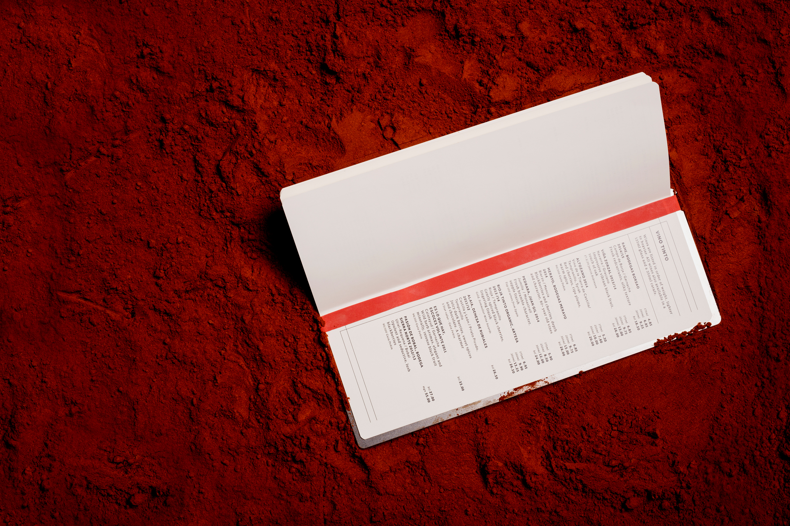
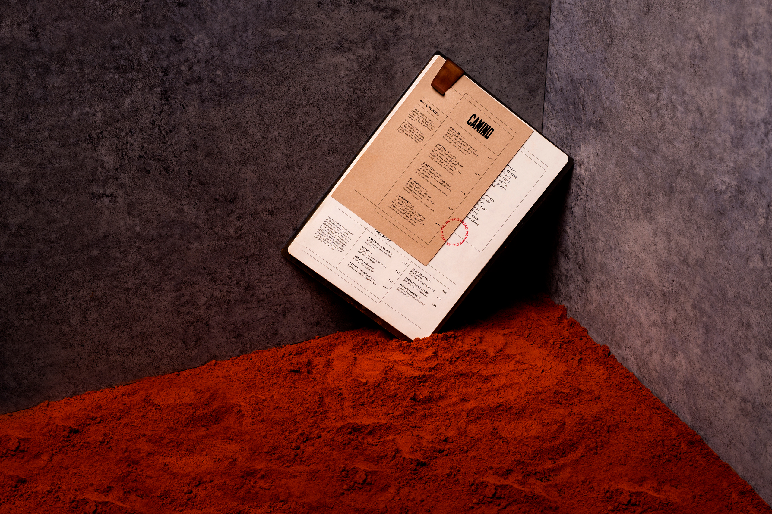
Brand refresh for a family of four tapas bars located around London. Blacksheep aimed to reconnect Camino with their story and use it to define each element of the design, using it to enforce the authenticity of their offer. The first Camino may not have opened until 2007, but it was an idea that had germinated in the mind of founder, Richard Bigg’s mind since long before. The result of an intense road-trip up and down the Spanish heartland in the summer of 1984. It was a trip that changed, and defined his life. The Landscapes, the people and the lifestyle combining to make such an impression that Richard felt it necessary to bring as much as he could back to London with him. The identity reflects this generous sharing of experience, making direct reference to real-world Spain throughout the interior and graphic designs. A curation of elements which combine to teleport the guest into Richard’s stories. This can be seen in the interior styling, but also in the typographic system whereby the sans-serif titling font references vintage sports fly-posters, while the more reserved serif font is borrowed directly from one of Spain’s biggest national newspapers. Materials are wholesome and authentic. Ironwork, hand-painted tiles and re-purposed sherry barrels are mixed with robust saddle leathers, while the construction of the menus is a nod to traditional Andalusian folk crafts. A custom made metal clip holding together a collection of pages made to reference how a traveller might collect ephemera and document their experiences in a scrapbook. Since completion Camino have continued their expansion with the opening of a further London site, continuing to share the adventure with the next generation of Londoners. Project completed at Blacksheep